About the Brand
AVEN is an import company specializing in high-quality products, including tea, coffee, and more. Our mission is to deliver the finest flavors and quality while ensuring reliable partnerships and a consistent supply to our customers.
AVEN is an import company specializing in high-quality products, including tea, coffee, and more. Our mission is to deliver the finest flavors and quality while ensuring reliable partnerships and a consistent supply to our customers.
Brand Concept
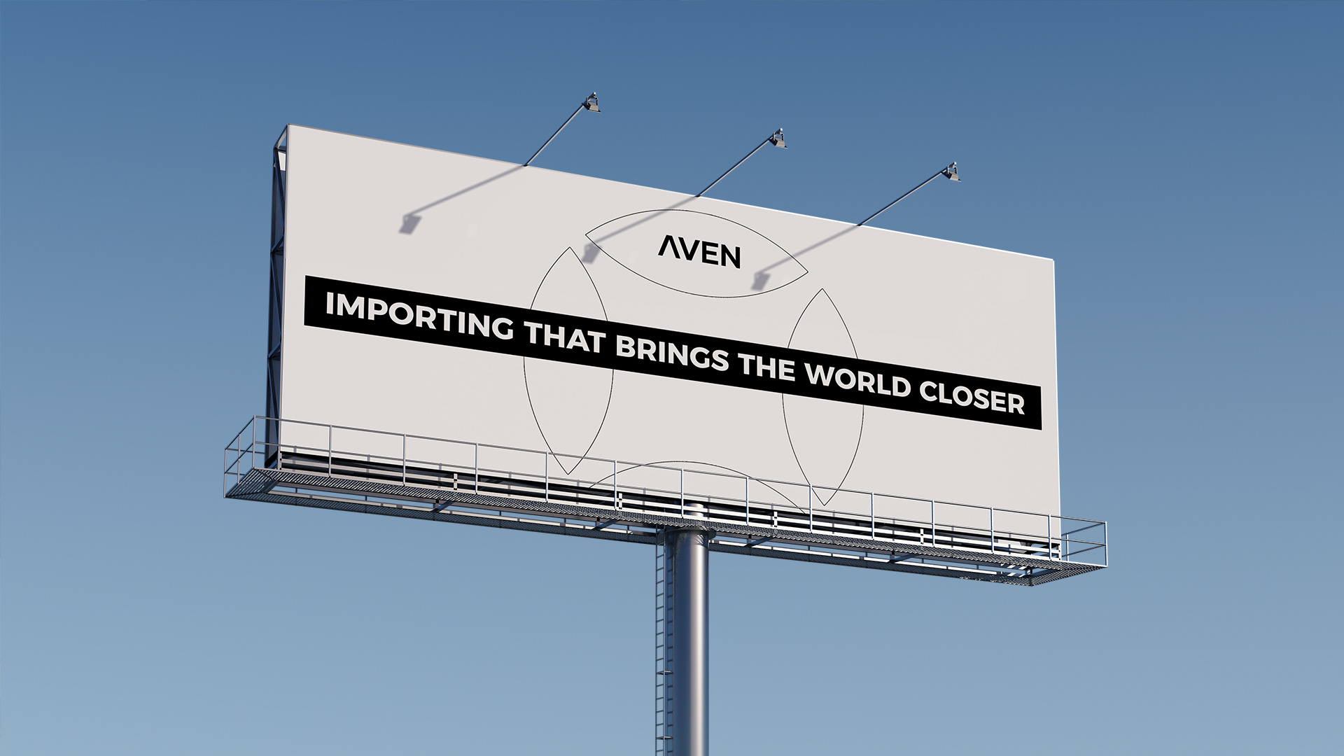
The brand concept is based on routes, connections, and diversity. The name AVEN reflects trade routes, premium product imports, and seamless distribution.
The brand concept is based on routes, connections, and diversity. The name AVEN reflects trade routes, premium product imports, and seamless distribution.
My Role & Solution
For this branding project, I developed the concept, logo, color palette, typography system, and overall visual identity. The goal was to create a modern yet timeless and trustworthy brand image that seamlessly adapts to different media.
For this branding project, I developed the concept, logo, color palette, typography system, and overall visual identity. The goal was to create a modern yet timeless and trustworthy brand image that seamlessly adapts to different media.
My solution includes
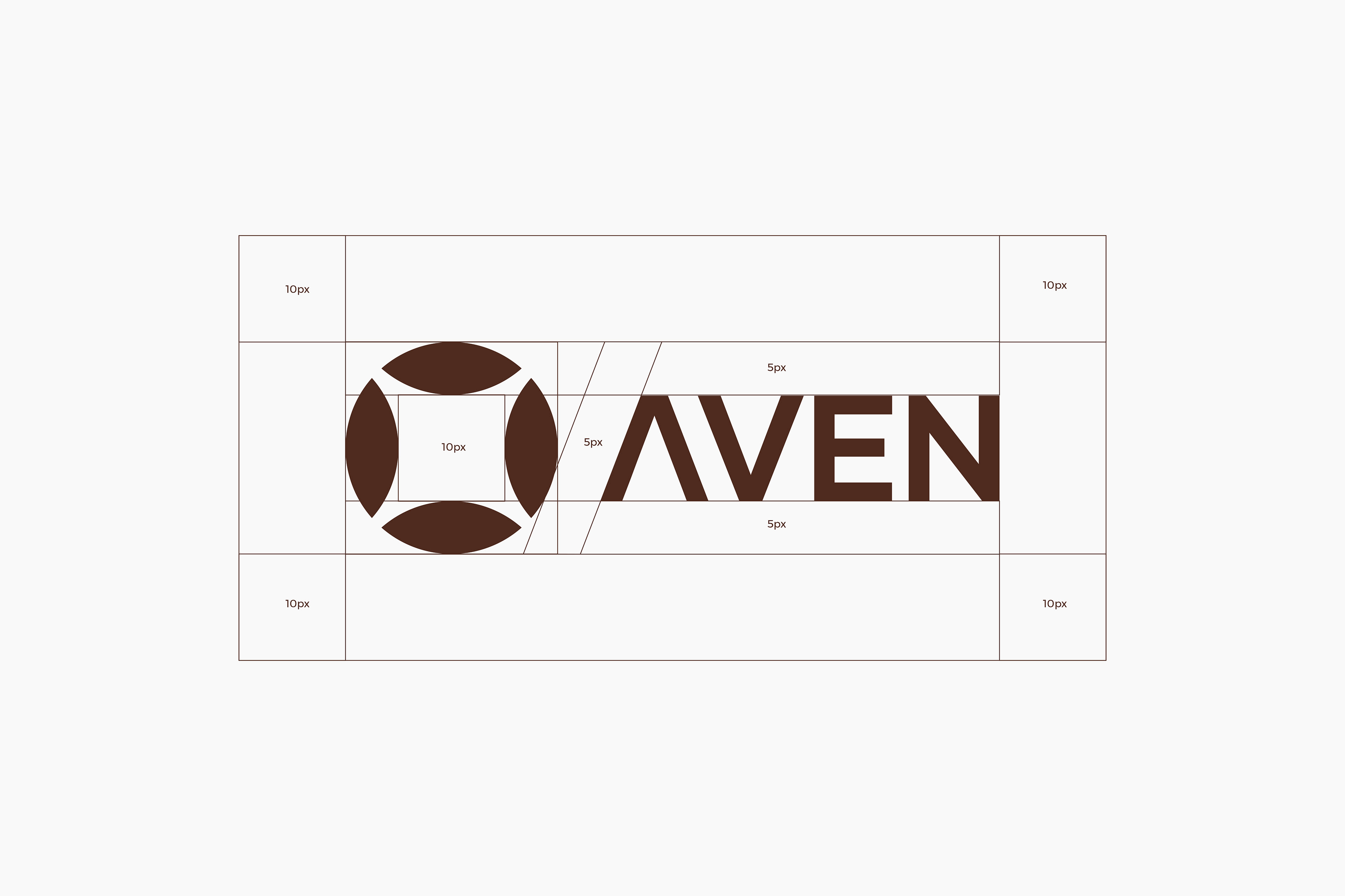
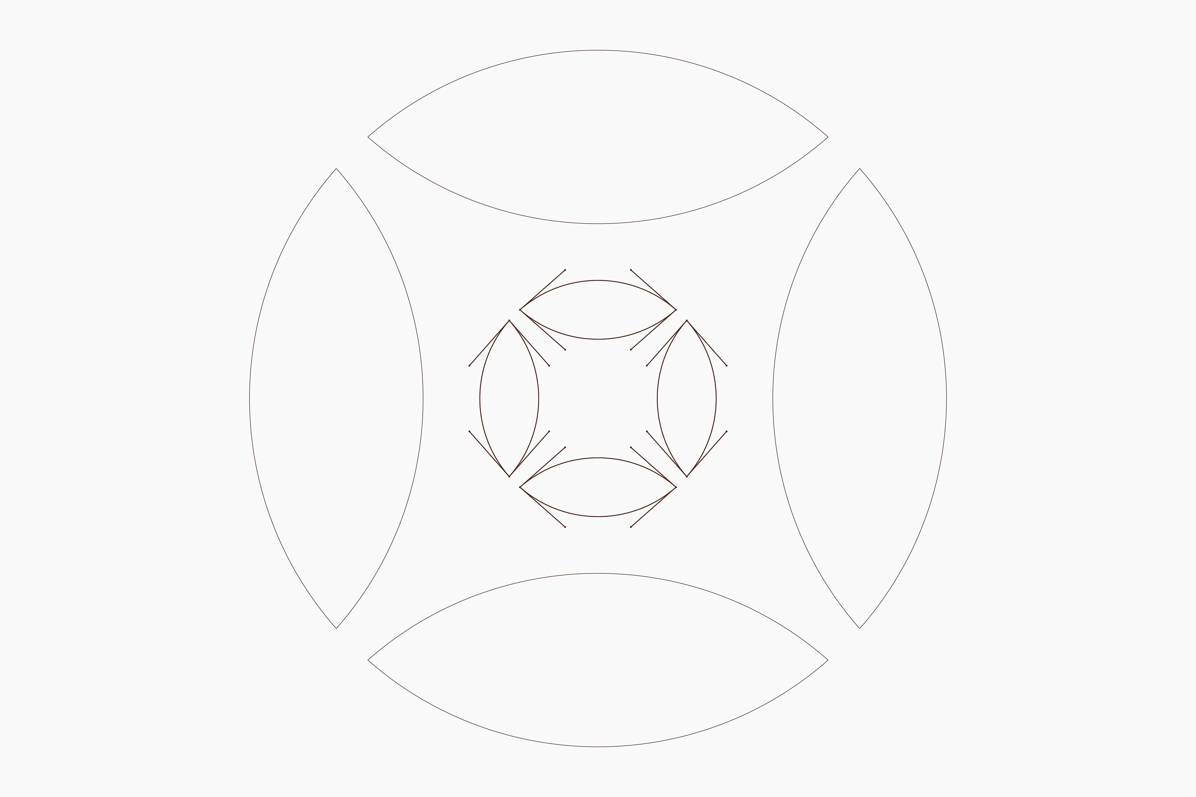
- Logo design – A mathematically precise and well-balanced composition.
- Color selection – A palette that reflects the brand’s core values.
- Typography system – A structured, modern typeface for clarity and impact.
- Brand graphics – Additional visual elements that reinforce the brand’s concept.
- Logo design – A mathematically precise and well-balanced composition.
- Color selection – A palette that reflects the brand’s core values.
- Typography system – A structured, modern typeface for clarity and impact.
- Brand graphics – Additional visual elements that reinforce the brand’s concept.
Client. Aven
Years. 2025
Location. Armenia
Graphic designer. Artyom Davtyan
Color & Typography Choice
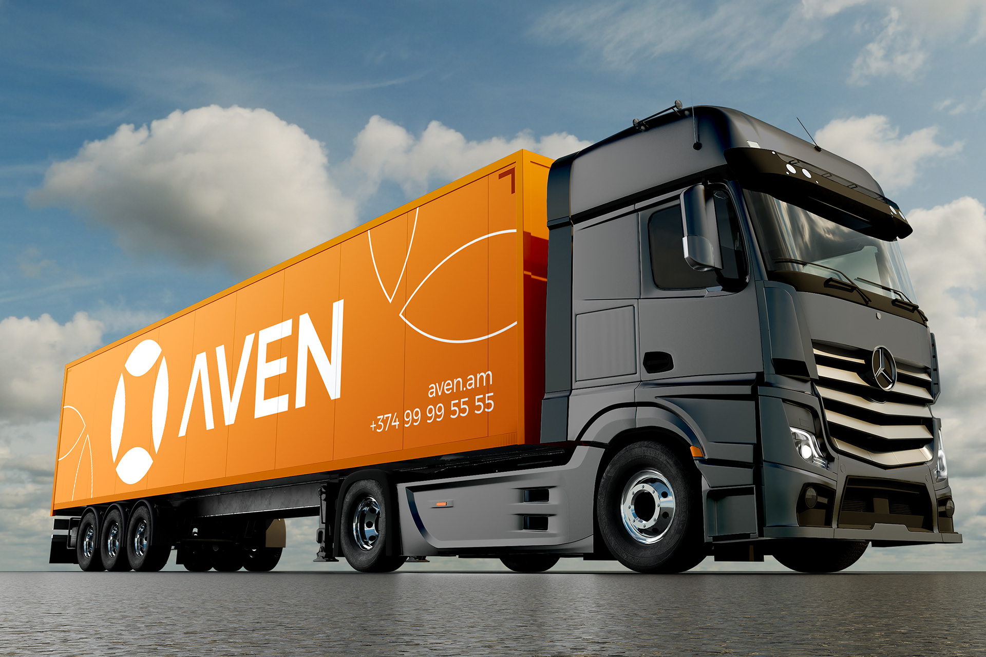
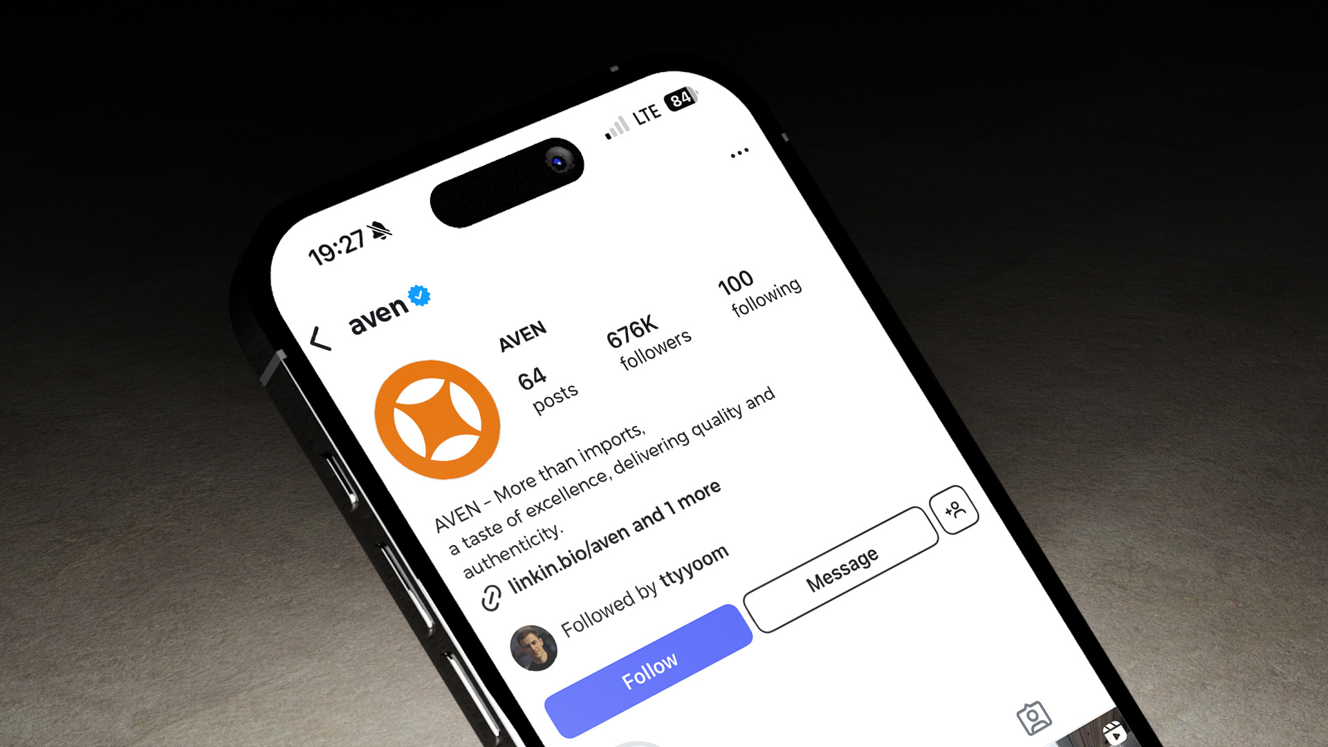
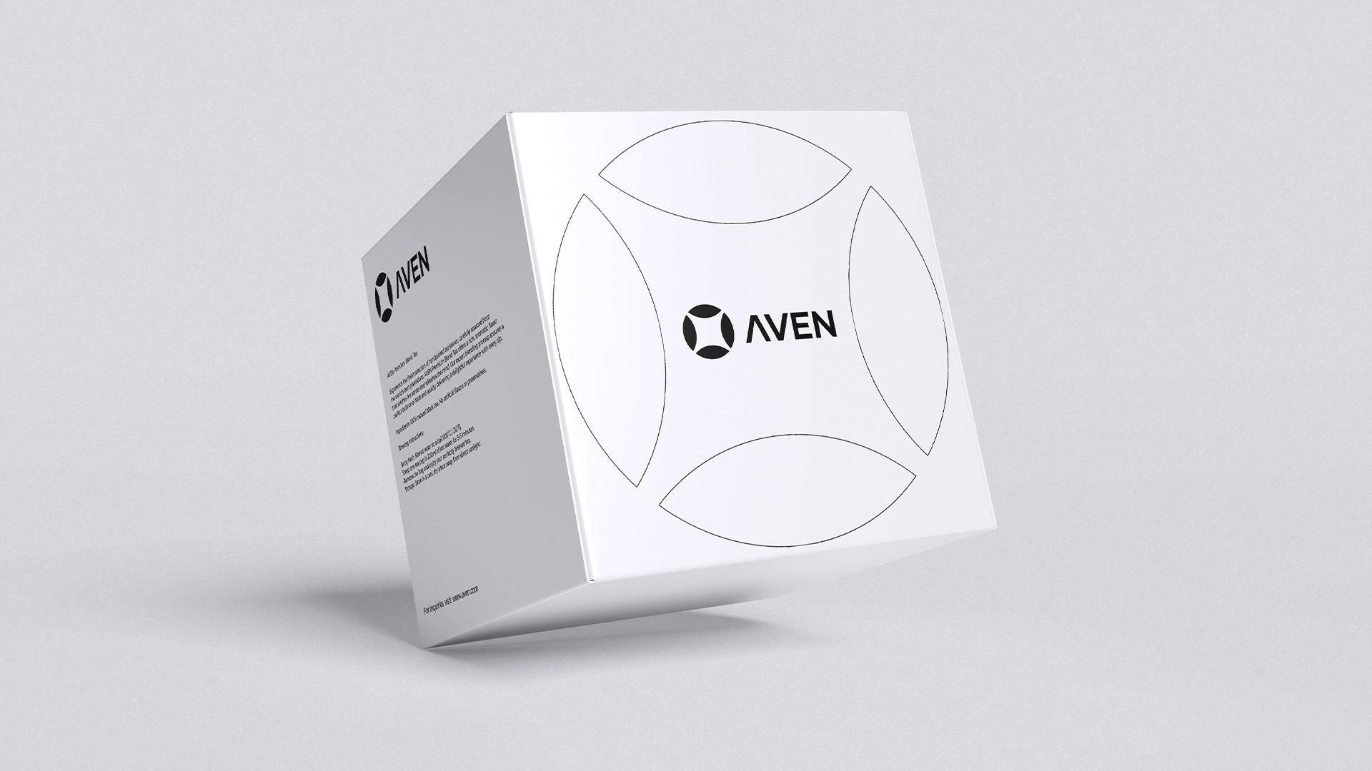
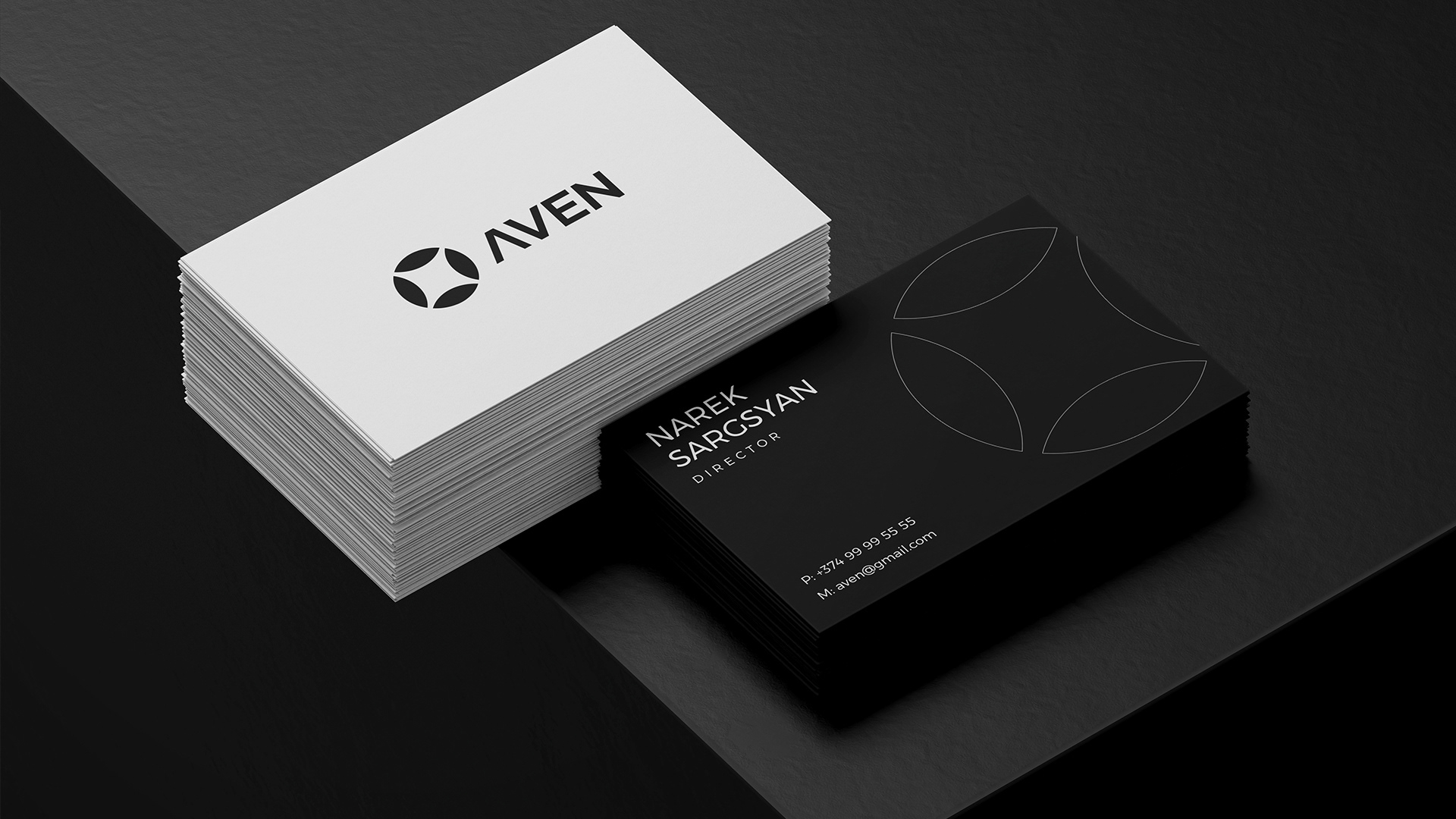
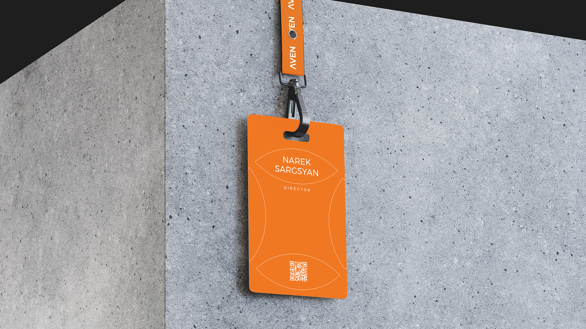
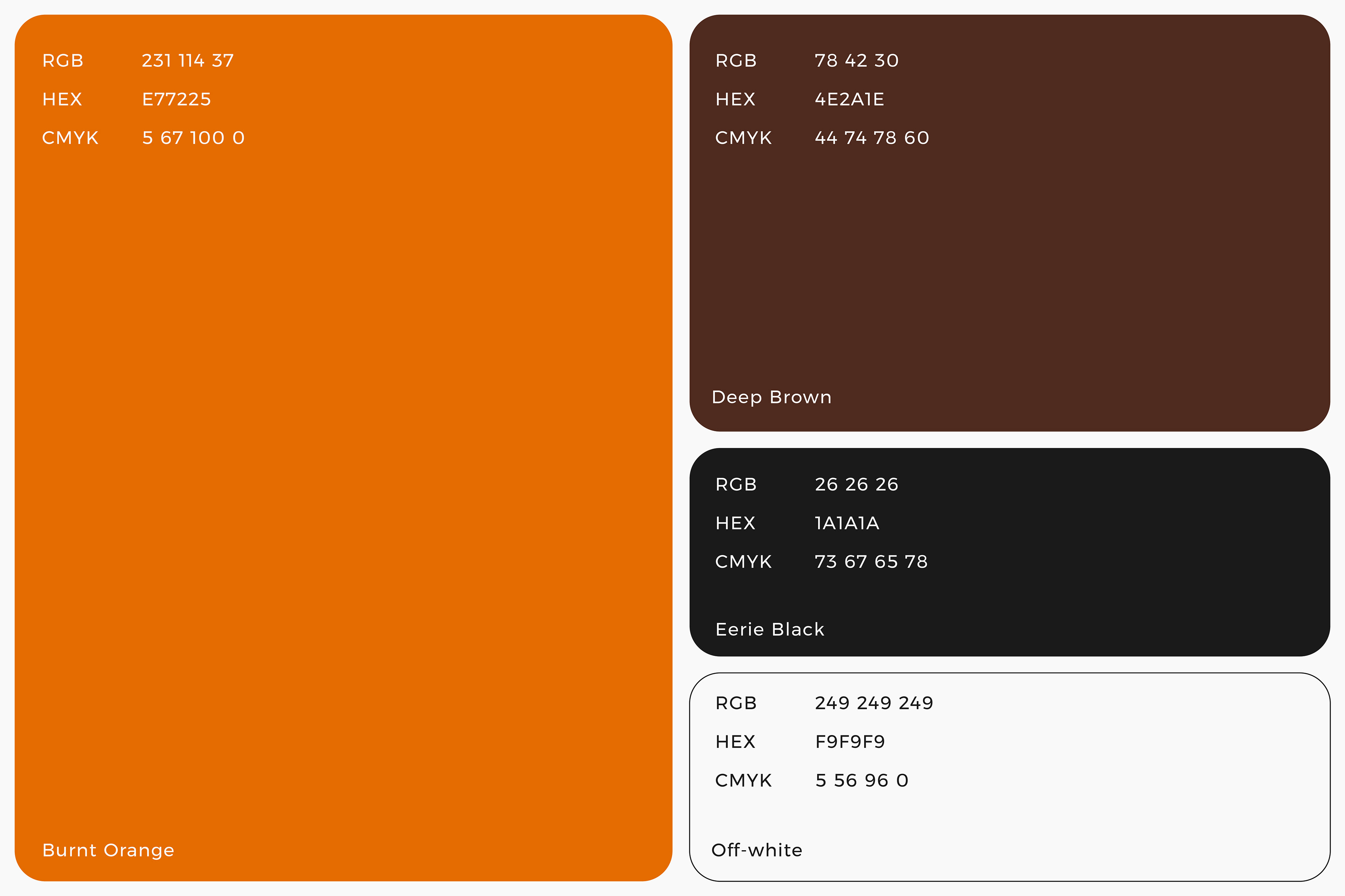
The color palette—Burnt Orange, Deep Brown, Off-white and Eerie Black—has been carefully curated to evoke warmth, trust, and professionalism. Burnt Orange adds a dynamic and inviting touch, while Deep Brown and Eerie Black reinforce a sense of stability and sophistication, creating a balanced and refined brand identity.
The color palette—Burnt Orange, Deep Brown, Off-white and Eerie Black—has been carefully curated to evoke warmth, trust, and professionalism. Burnt Orange adds a dynamic and inviting touch, while Deep Brown and Eerie Black reinforce a sense of stability and sophistication, creating a balanced and refined brand identity.
For typography, the Gilmer typeface was chosen for its clean, geometric, and modern aesthetic. Its high readability and contemporary feel ensure that AVEN maintains a strong, reliable, and professional presence across all branding materials.


Logo Concept
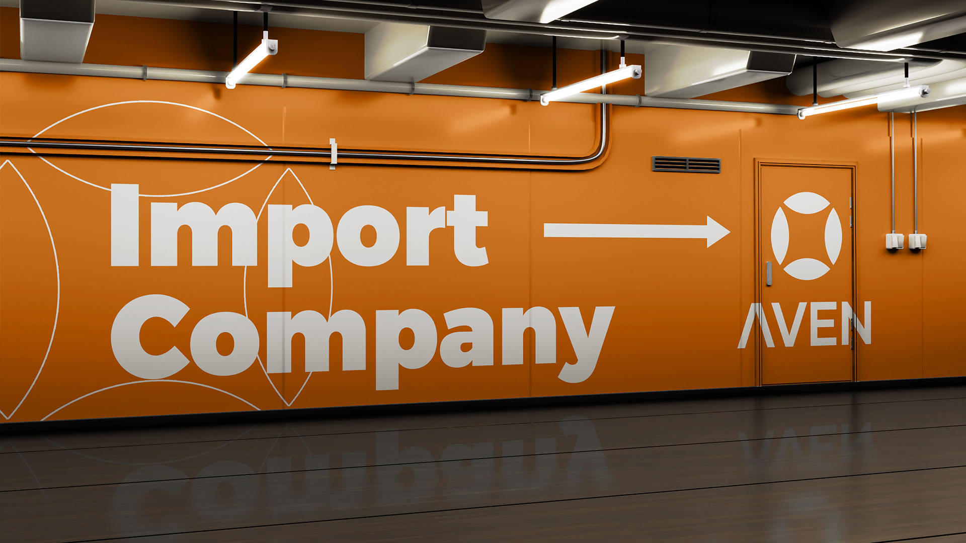
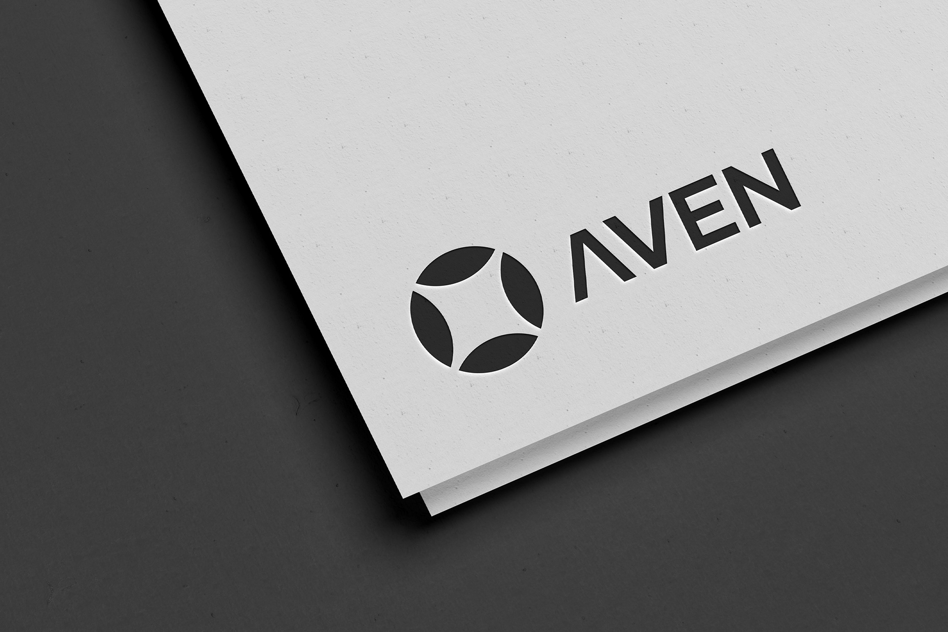
The logo symbol represents a fusion of connection, movement, and balance. Each element within the symbol embodies products, partnerships, and trade pathways. The design is minimal yet impactful, ensuring adaptability across various applications.
The logo symbol represents a fusion of connection, movement, and balance. Each element within the symbol embodies products, partnerships, and trade pathways. The design is minimal yet impactful, ensuring adaptability across various applications.