About the Brand
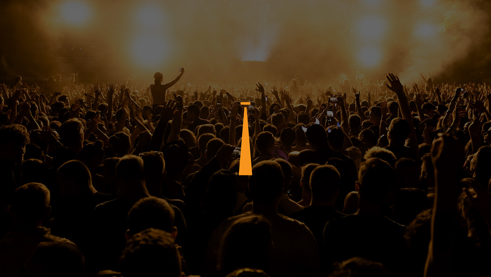
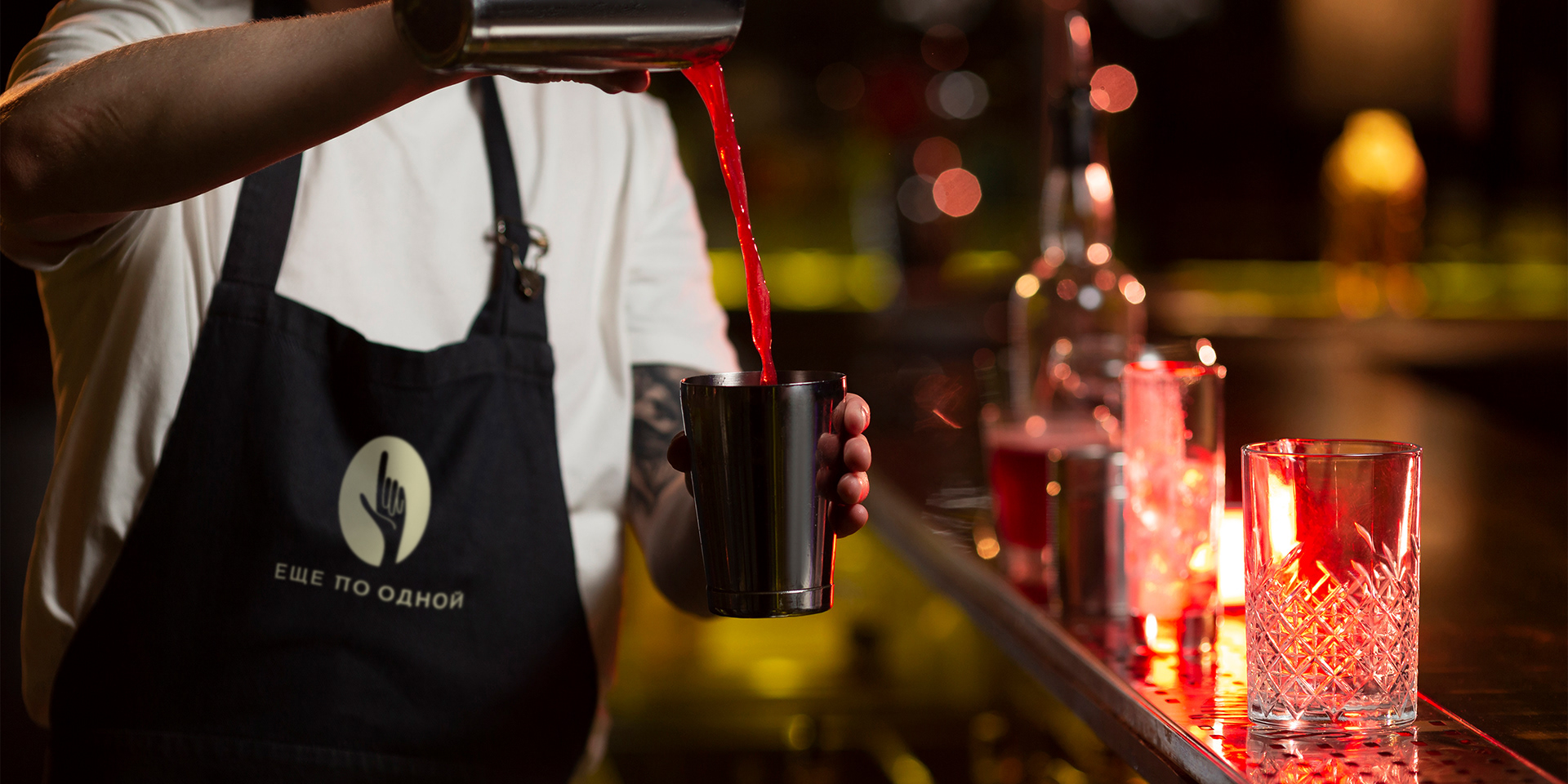
"Ещё по одной" is a vibrant and welcoming bar that embodies the spirit of good company, lively conversations, and unforgettable nights. Inspired by the phrase "One more?" it captures the essence of sharing drinks and moments with friends.
"Ещё по одной" is a vibrant and welcoming bar that embodies the spirit of good company, lively conversations, and unforgettable nights. Inspired by the phrase "One more?" it captures the essence of sharing drinks and moments with friends.
Brand Concept
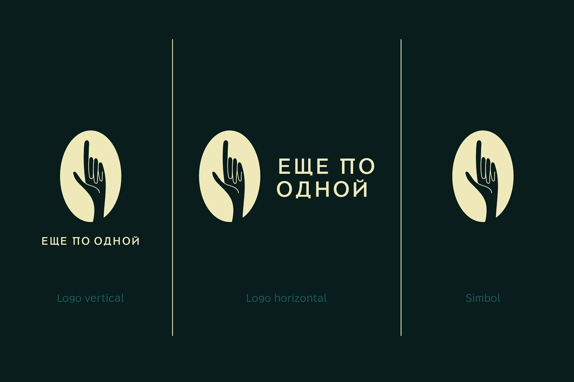
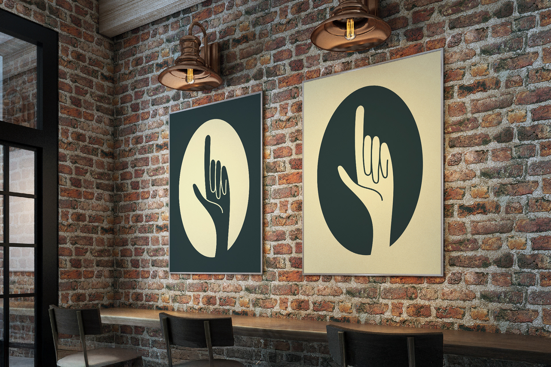
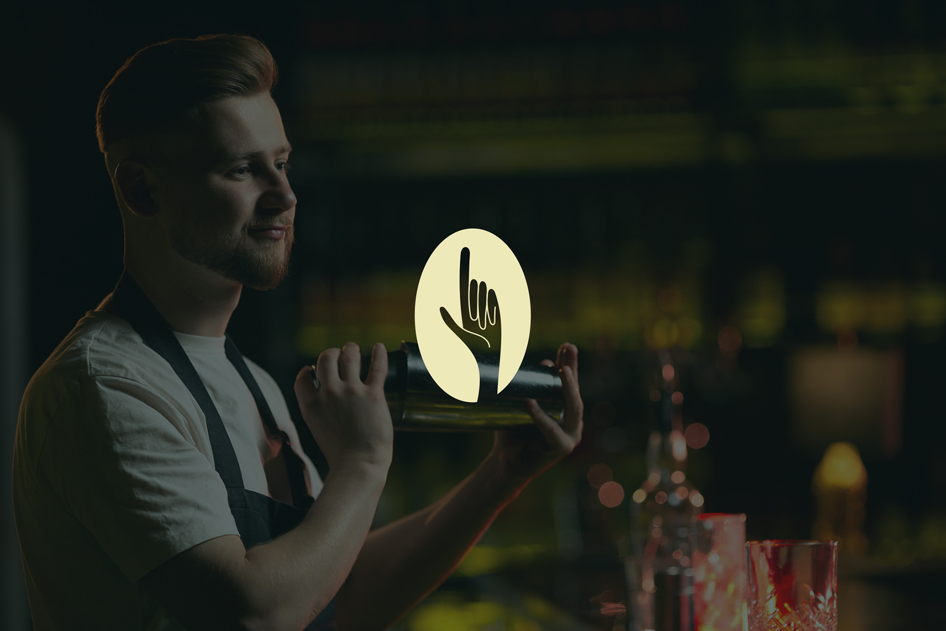
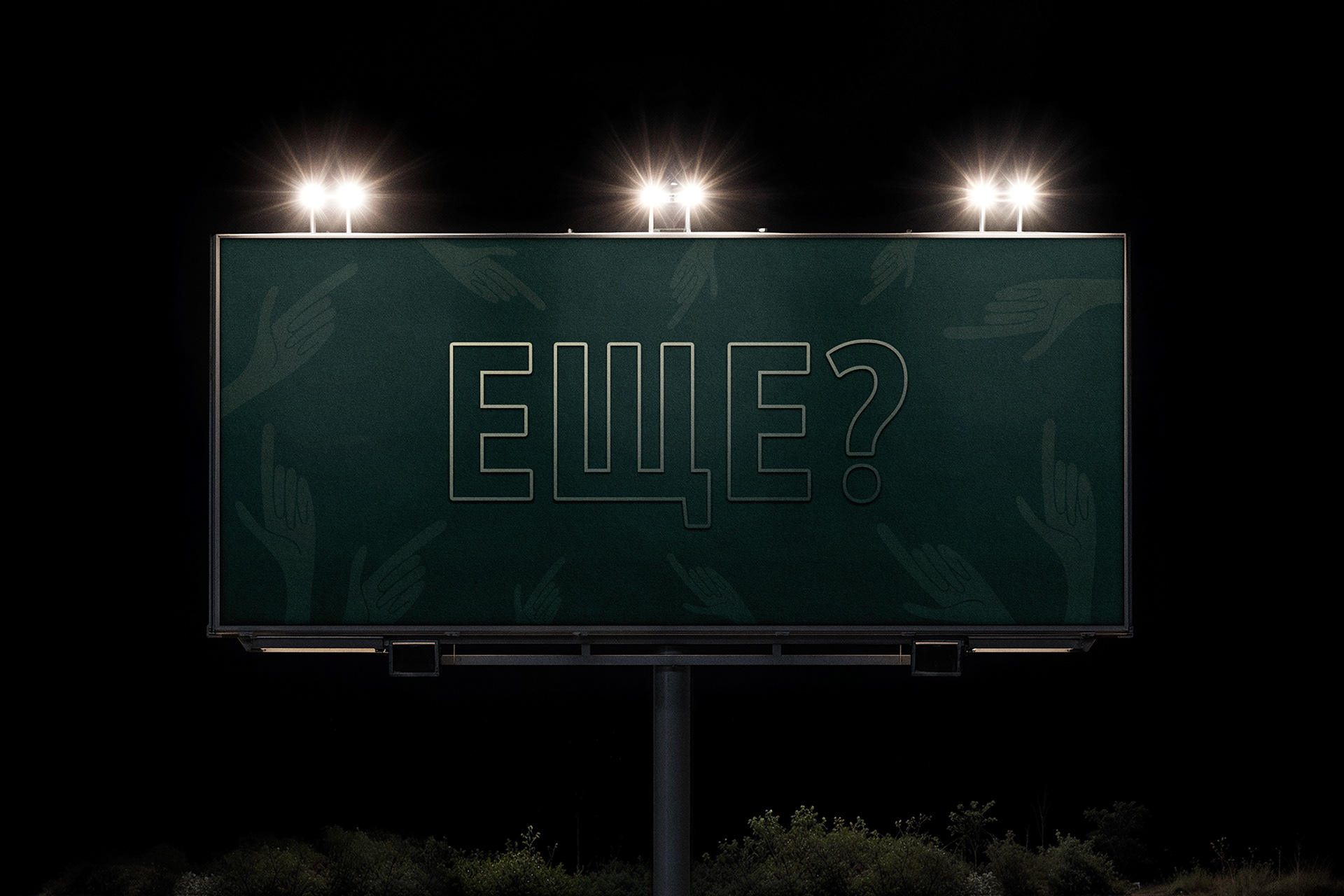
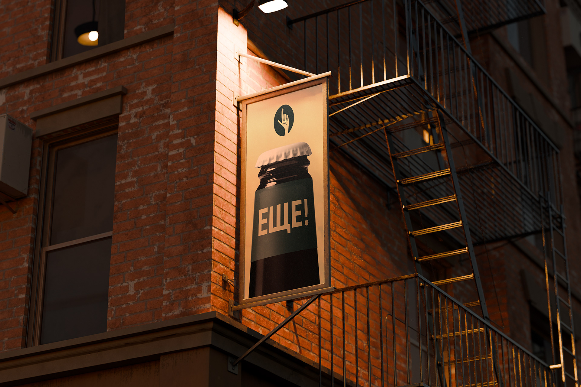
The brand is built around a simple yet powerful gesture—a raised finger, universally recognized as a way to order another round. This visual cue seamlessly blends into the identity, making the logo intuitive and instantly memorable.
The brand is built around a simple yet powerful gesture—a raised finger, universally recognized as a way to order another round. This visual cue seamlessly blends into the identity, making the logo intuitive and instantly memorable.
My Role & Solution
My task was to create a brand identity that feels both inviting and stylish while avoiding overused bar-related clichés. I developed a clean yet playful design system that balances minimalism with personality. The hand symbol serves as a direct call to action, reinforcing the name and concept in a smart and engaging way.
My task was to create a brand identity that feels both inviting and stylish while avoiding overused bar-related clichés. I developed a clean yet playful design system that balances minimalism with personality. The hand symbol serves as a direct call to action, reinforcing the name and concept in a smart and engaging way.
Client. Еще по одной
Years. 2025
Location. Russia
Graphic designer. Artyom Davtyan
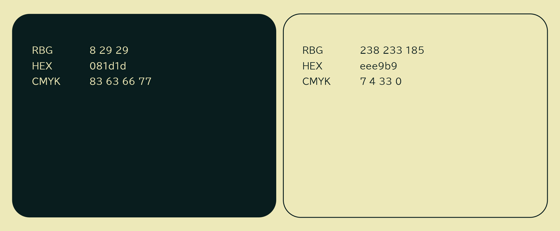
Color & Typography Choice
The color palette creates a perfect balance between warmth and sophistication—soft and inviting yet bold and modern. It evokes a sense of nostalgia while maintaining a sleek, contemporary edge.
For typography, BIZ UDPGothic was chosen for its clean yet slightly angular structure, ensuring readability and personality without feeling overly rigid. It strikes a balance between casual and refined, seamlessly integrating with the brand’s identity.

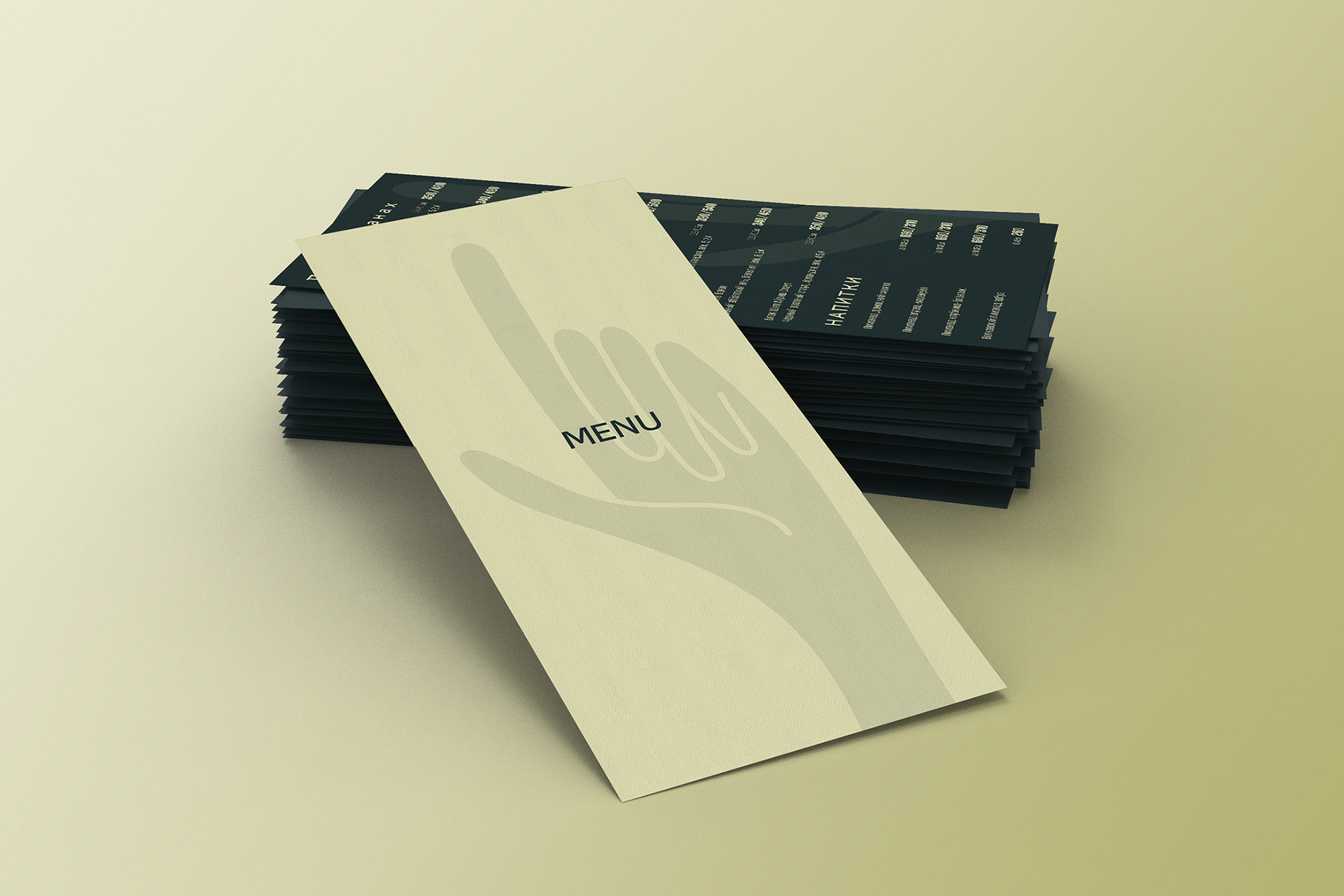
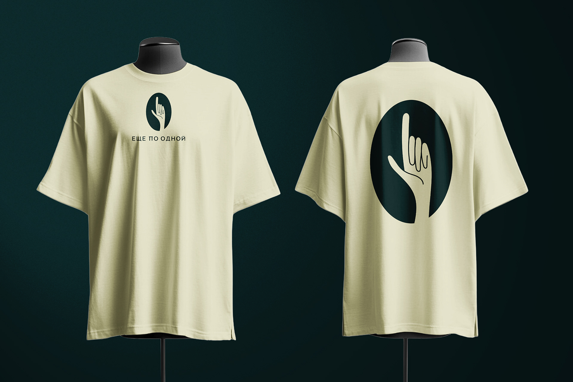
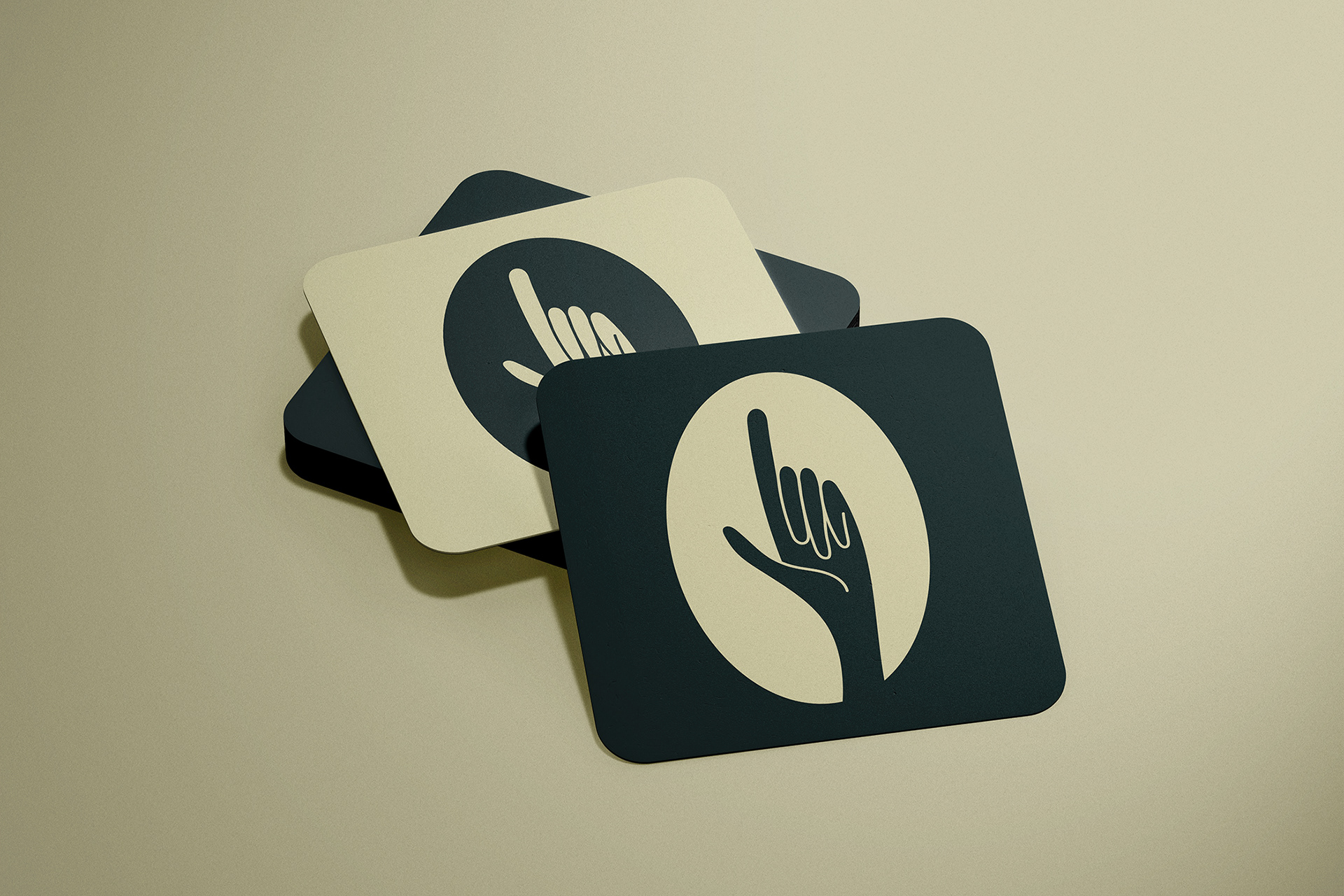
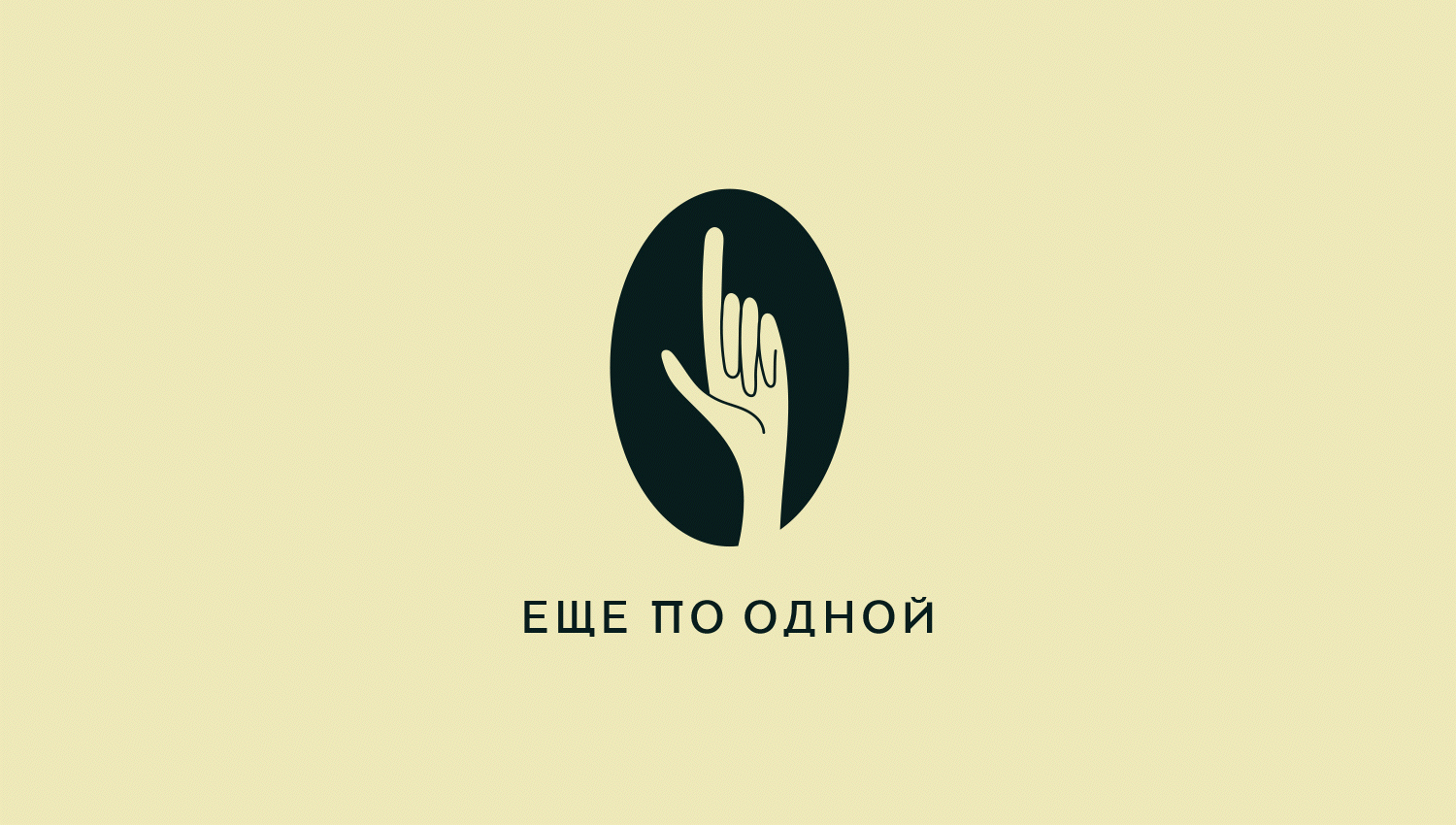
Logo Concept
The logo embodies the essence of the brand through a simple yet impactful visual—a raised finger gesture, universally recognized as a sign for ordering another drink. This minimal yet expressive mark reinforces the brand name in an intuitive and memorable way.
By avoiding overused bar symbols like glasses or bottles, the logo remains fresh and distinctive. Its clean, modern design ensures versatility across different applications while maintaining a playful and inviting character